And the Academy Award for Clarity Does NOT Go to. . .
Feb 26, 2014
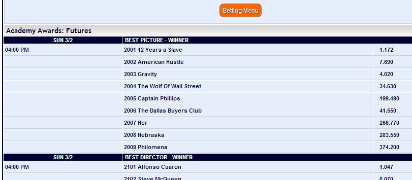
Far be it from me to help a gambling website present information better, and one based in Curacao to boot, but I can’t help myself. My friend John Cardozo sent me a link to the Pinnacle Sports website, where the betting odds for the upcoming Academy Awards are posted. Here’s part of it:

The biggest problem is that the numbers are not right-justified. That’s Deadly Sin #1 of quantation, because it makes the numbers much harder to read. For a site that wants its visitors to absorb important content in just a few seconds, that can be fatal. Moreover, there’s too much white space (OK, light blue space), increasing the odds that a visitor will line up the odds with the wrong film. And lastly, it would be a courtesy to the reader to sort the films in order, from shortest odds at the top to longest odds at the bottom. Here’s my recommended version of the same information:

As with my last post, these are situations where very small changes in the way information is presented can have a large impact on how easy it is to understand, especially when instant impressions are important. (I might also add that for the betting neophyte, it’s extremely difficult to navigate through the website and actually understand how these odds work. Now, why would the site want to do that?)
For my money, I’m rooting for American Hustle. . . .
“Painting with Numbers” is my effort to get people talking about financial statements and other numbers in ways that we can all understand. I welcome your interest and your feedback.

The biggest problem is that the numbers are not right-justified. That’s Deadly Sin #1 of quantation, because it makes the numbers much harder to read. For a site that wants its visitors to absorb important content in just a few seconds, that can be fatal. Moreover, there’s too much white space (OK, light blue space), increasing the odds that a visitor will line up the odds with the wrong film. And lastly, it would be a courtesy to the reader to sort the films in order, from shortest odds at the top to longest odds at the bottom. Here’s my recommended version of the same information:

As with my last post, these are situations where very small changes in the way information is presented can have a large impact on how easy it is to understand, especially when instant impressions are important. (I might also add that for the betting neophyte, it’s extremely difficult to navigate through the website and actually understand how these odds work. Now, why would the site want to do that?)
For my money, I’m rooting for American Hustle. . . .
“Painting with Numbers” is my effort to get people talking about financial statements and other numbers in ways that we can all understand. I welcome your interest and your feedback.
Related Blogs
Other Topics
Other Topics


