

Literacy in the County Clerk's Office
May 9, 2011
When you write about presenting numbers, sometimes your subject matter is right under your nose. This morning I was in my local county clerk’s office, and I ran across a piece of paper taped to a table in the waiting room:

Does this information look useful to you? Why was it taped to a table? I’m not sure. It probably has to do with recording a person’s height, since the “Feet” number ranges from 5’ to 6’4”, and this office does process driver’s licenses and passports. But this document has some design flaws:
OK, enough of this. Here’s another try at presenting the same information:
Now we have a table that’s easy to read, linguistically accurate, and – in less space! – can be used to convert in either direction.
If the document displaying this level of literacy had been a posted memo, instead of a length conversion table, everyone would be chortling about it at the water cooler or over cocktails. But as you can see, the little things also make a big difference in quantation, just as they does in written English.
“Painting with Numbers” is my effort to get people talking about financial statements and other numbers in ways that we can all understand. I welcome your interest and your feedback.
Does this information look useful to you? Why was it taped to a table? I’m not sure. It probably has to do with recording a person’s height, since the “Feet” number ranges from 5’ to 6’4”, and this office does process driver’s licenses and passports. But this document has some design flaws:
- Column order. This table must be for converting feet to meters, not the other way around – the Feet numbers are given to the nearest inch, and the Meters are the calculated numbers, taken out to four decimal places. In this part of the world, we read from left to right, so the columns should be switched.
- Precision. Height measurements in meters need only two decimal places – 0.01 m. (or 1 cm.) is the metric “inch.” The two additional decimal places add nothing, and get in the way of the reader seeing the meaningful digits.
- The words! What the heck is a “mass conversion”? Isn’t mass a unit of weight, not length? Or maybe it’s some sort of religious ceremony. And what are “proper feet”? Nicely shaped, aristocratic ones? And I’d say the “inches” are feeling kind of left out.
- The layout. The two columns are unnecessarily far apart, making it hard to read along a single row. Just because white space is available, doesn’t mean you have to use it.
- Teensy details. In a column of numbers, it’s customary to show every number with the same number of decimal places – zeroes are digits, too. And this is the USA – we use periods, not commas, as decimal points. And it’s customary to justify numbers, not center them as they’re shown in the Feet column. Oh, and the instruction at the top – to divide by .3048 – makes no sense when both feet and inches are involved.
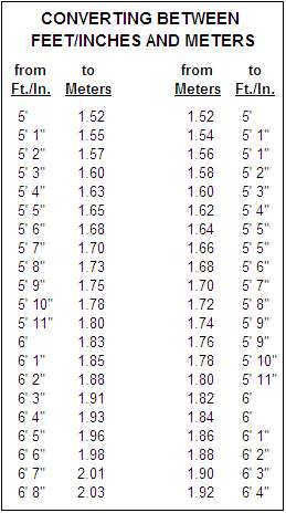
OK, enough of this. Here’s another try at presenting the same information:
Now we have a table that’s easy to read, linguistically accurate, and – in less space! – can be used to convert in either direction.
If the document displaying this level of literacy had been a posted memo, instead of a length conversion table, everyone would be chortling about it at the water cooler or over cocktails. But as you can see, the little things also make a big difference in quantation, just as they does in written English.
“Painting with Numbers” is my effort to get people talking about financial statements and other numbers in ways that we can all understand. I welcome your interest and your feedback.
Related Blogs
Other Topics
Other Topics