

Again with the Most Useful Graph Ever, This Time for MBOs
Sep 29, 2015
Last week, we looked at a simple, handwritten graph that’s a great example of what graphs and data visualization are really for – to help people get a sense of trends, patterns, and what behavioral consequences might be. Now let’s use that same approach to understand a typical management-by-objective (MBO) bonus plan for line managers and key employees.
Here’s the MBO bonus plan in place at one company when I joined them as CFO:
- Almost all employees participated, with target MBO bonuses ranging from 5% of base salary for entry-level employees to 30% of salary for senior managers.
- The maximum MBO bonus payout was 100% of the target amount.
- Each employee’s MBOs were scored on a 0%-100% scale, and his/her bonus payout equaled that percentage of the target MBO bonus. Except that…
- A well-meaning but demanding board member insisted that only those with MBO achievement scores of at least 85% should receive a bonus. So here’s what my favorite graph looks like, for this plan:
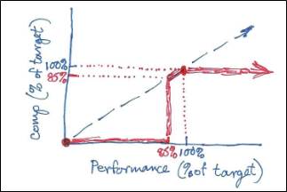
With this graph in hand, it’s easy to see that:
- The financial consequence of scoring just below 85% is huge, so no rational, self-respecting employee ever scored him/herself below 85%.
- To the extent that MBO scores are based on objective measures, consider the lengths employees will go to in order to ensure that they scored at least 85%. This is a moral hazard.
- Few managers at this company could bring themselves to give scores below 85% to any but the most flagrant non-performers.
As a result, almost all employees’ MBO scores were tightly bunched in the 85%-100% range, making the scores nearly meaningless for ranking employees and identifying top performers. Moreover, all but the worst performers ended up getting paid at least 85% of their target bonus. So we made the following changes to the plan:
- The minimum MBO score for a bonus payout would be 60% – much like a passing grade in high school.
- For MBO scores between 60% and 100% (or higher), the payout would range from 0% to 100%, calculated by linear interpolation. So now our graph looks like:
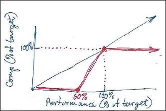
Now that nowhere in the possible scoring range did a 1% reduction in MBO score have a dire financial consequence, managers were more willing to give MBO scores across a wide range, making scoring comparisons more meaningful. Moreover, the company-wide total payout ended up being less, since payouts could range from 0% to 100% rather than the 85%-100% payout that went to all but the worst performers.
The graphs helped us identify a different, better approach to MBO bonuses. This is what data visualization is for. However, graphs and other data visualization techniques are most effective only in certain situations – and if they’re overused, they’re less effective even in those certain situations.
“Painting with Numbers” is my effort to get people to focus on making numbers understandable. I welcome your feedback and your favorite examples. Follow me on twitter at @RandallBolten.Other Topics