

Getting High on Bad Data Visualization
Apr 3, 2017
For my annual (well, nearly annual) April Fool’s Day post, we revisit some of the past year’s most useless and inane numbers presentations. This year we celebrate an infographic about marijuana use in the U.S. in the recent past. This graph is this year’s winner because it is not only shockingly incompetent, but appeared on the website of a news outlet – CBS News – that really should know better. Here’s the graph:
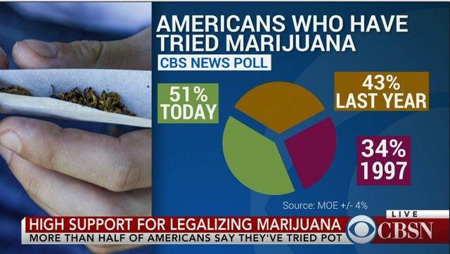
Pie charts are almost always a bad way to present information in the first place (click here, here, and here for recent discussions of this overused technique), but when used correctly pie charts are intended to show each component’s share of a whole. For example, it could make sense to use a pie chart to compare the number of recreational drug users whose preferred drug was marijuana to the numbers whose first choices were alcohol, cocaine, or amphetamine. Or you could use a pie chart to show the share of a marijuana user’s household income spent on laughing tobacco to the corresponding shares spent on food, rent, clothing, and other sports and entertainment. But it makes absolutely no sense to use a pie chart to compare marijuana use in three separate time periods.
We can only speculate on what the presenter smoked before preparing this infographic. I’m sorry that we’re out of space today, but in coming weeks we’ll take a look at some of the April Fool’s Day runners-up entries.
As an aside, what’s described above is not the only thing that’s wrong with this pie chart. Unless you happened to know the date the graph was posted – April 20, 2016, as it happens – you would have no way of knowing what “Today” and “Last Year” were. That type of omission is discourteous to your audience.
Moreover, wildly varying time intervals – one year (2016 vs. 2015) and 18 years (2015 vs. 1997), in this particular example – are generally a poor way to present information comparisons, regardless of the type of graph or table being used. That’s because the differing time intervals make it hard for the reader to form any conclusion about the relative rates of change.
I guess marijuana users get sloppy with their infographics, especially when it’s really good weed.
In fairness to CBS News, I must admit that the above graph is no longer part of the original news item that originally included it. Someone at CBS News must have chilled out.
“Painting with Numbers” is my effort to get people to focus on making numbers understandable. I welcome your feedback and your favorite examples. Follow me on twitter at @RandallBolten.
Other Topics