Oh, No! My Pie (Chart) Hits the Wall!
Feb 8, 2017
My last blog looked at how U.S. federal government outlays were distributed in 2015 – one of the few situations I’ve found where a pie chart actually works! But taking a deeper look at the issue, and especially considering federal spending trends over time, we’ll see that pie charts are severely limited. We need a better presentation approach, and in the process we’ll come face-to-face with the limitations of data visualization.
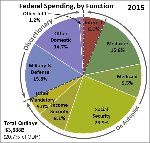
To refresh your memory, here’s the pie chart we looked at last week:

In a single image, we see that less than one-third of federal spending is “discretionary” – that is, money that can be controlled by Congress in the annual appropriations process. The other two-thirds or more is “mandatory” spending – which can’t be changed without passing new laws – plus interest on the national debt, which can’t be ignored.
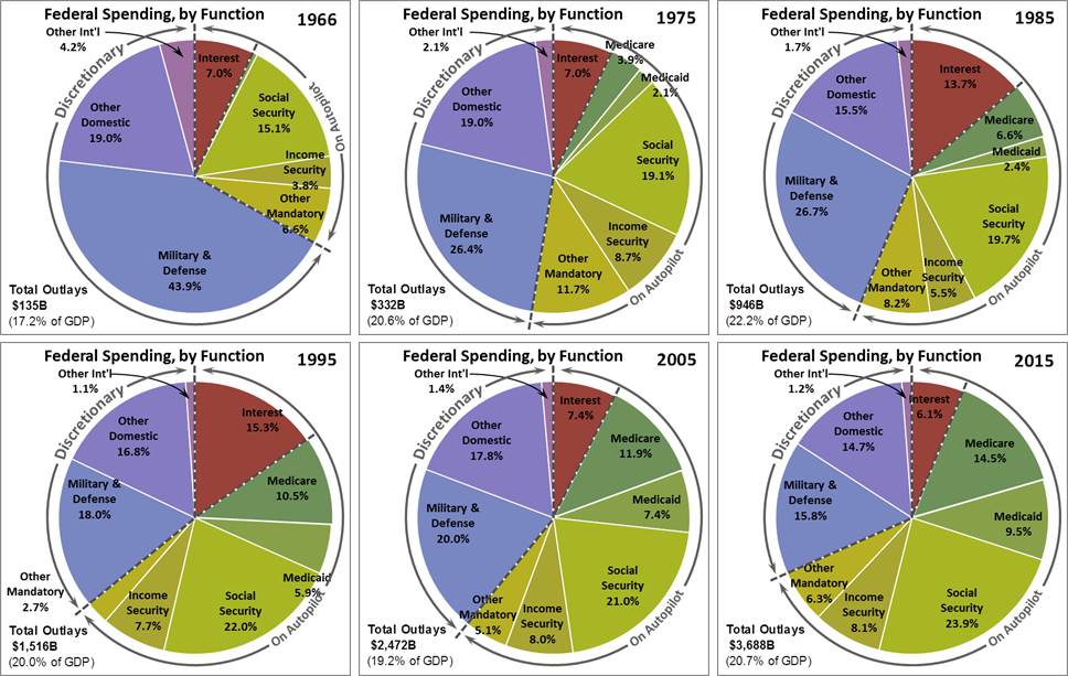
But a snapshot of a single year has virtually no meaning. Just as with an enterprise’s financial statements, numbers mean nothing unless they can be compared to something else – over time, vs. budget, vs. competitors, etc. Here, let’s look at federal spending over time – have things gotten worse or better? So sticking with the pie chart motif, here’s a look at federal spending at ten-year intervals:

This visual tells us that…
- Discretionary spending – the bluish wedges – is a steadily shrinking share of federal spending, changing steadily from about two-thirds of federal outlays in 1966 to less than one-third in 2015.
- Mandatory spending – the greenish wedges – has grown even more dramatically, from about one-fourth of spending in 1966 to nearly two-thirds in 2015.
Do you like this presentation? I don’t, and I’m the author! It was a lot of work, including much fiddling with colors, text placement, and added artwork. Even so, it has some fatal problems:
- It’s difficult to visually compare values in separate pie charts – let alone when they’re in the same pie chart. This may be the biggest drawback of pie charts.
- Only 6 of the 50 years in the database are presented. Will those six years represent the true trend, or are they “tainted” by special situations like recession, economic boom, or wartime? We could present fifty pie charts, but you’d go batty trying to read them all.
- Each pie chart is awfully small and hard to read, even with a compact 2x3 layout of the six chosen years. Just imagine what fifty pies would look like!
This illustrates the inherent limitations of the pie chart. Don’t use a pie chart unless you want to present only one or two data points, and you’re willing to use an entire page or screen to present it/them. And never try to present a trend or a pattern by showing side-by-side pie charts.
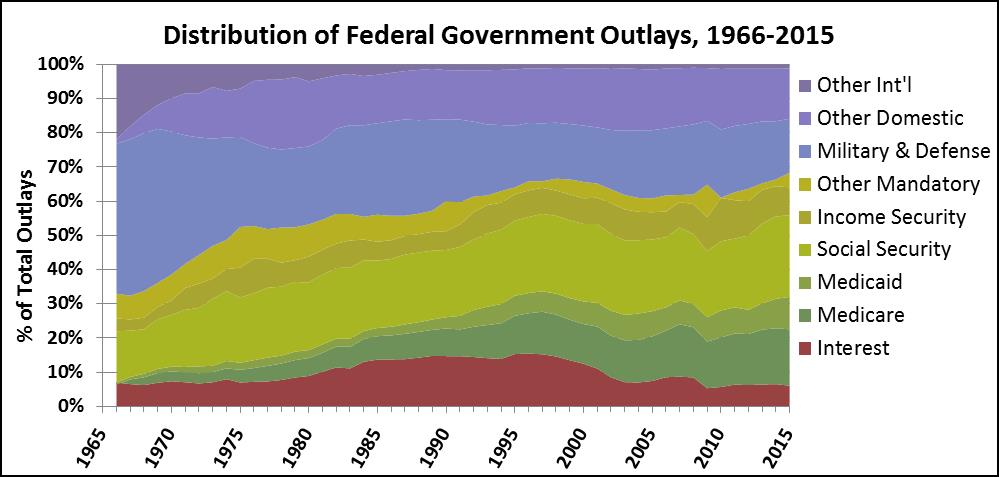
There are many better ways to illustrate Uncle Sam’s spending trend. Here’s an example:

This is a “Stacked Area Chart” (as it’s called in Excel), where the total height of the graph at each year stays constant at 100%. I like this choice of chart type because of the notion of a “river” of spending that is both visual and metaphorical. Most important, I’ve kept the same order of the Data Series (i.e., Interest, Medicare, Medicaid, etc.) and the same color scheme that you saw in last week’s pie chart. As a result, even though there are some ebbs and flows in federal spending, here are the trends that we can easily pick up from the above graph:
- Discretionary spending (the bluish area) has declined significantly over the 50 years. And since interest’s share of the federal pie (the reddish area) has stayed moderately steady, mandatory spending (the greenish area) has taken up essentially all of the spending capacity that discretionary spending relinquished.
- Military & Defense’s share (the lowest bluish area) has dropped dramatically, particularly in the first 10-15 years shown, as the Vietnam War wound down.
- Total non-military spending’s (i.e., Other Domestic plus Other Int’l) share has declined somewhat, from about 20% of the total to about 16%. But also note that the share of non-military spending shifted dramatically during the first 20 years of the time horizon, from overwhelmingly international to overwhelmingly domestic. That speaks to the increasing role that the federal government has come to play in our ordinary lives over the last 50 years.
- By far the largest increase in mandatory spending is in healthcare – which you can see from the adjacent Medicare and Medicaid areas at the bottom of the greenish area on the graph. Those two areas combined have gone from virtually zero in 1966 to fully 25% of Uncle Sam’s outlays in 2015.
- Social Security’s share (the series in the middle of the mandatory area) has grown by 2015 to be the single largest of the nine data elements. This share increase is due to not only a surge in Baby Boomer retirements, but to retirees living longer.
In other words, we can learn much more from a well-conceived graph than we can learn from a dumb ol’ pie chart.
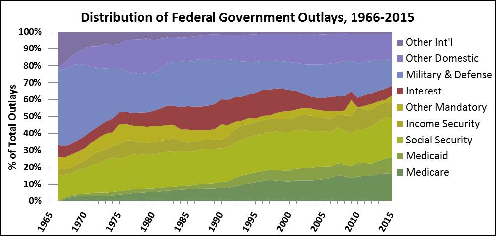
As a final, subtler observation about the Area Chart, note that it’s a lot easier to see how the discretionary (bluish) sector has changed over the 50 years than the mandatory (greenish) sector. That’s because the bluish area is “anchored” by a straight line along the top, while the greenish are sits on top the Interest data (the reddish area), which has had some ebbs and flows – remember that interest on the national debt is affected not just by the size of the debt, but by interest rates… which are at historic lows right now. We can fix this perceptual issue by moving the Interest data series upward to sit in between the discretionary and the mandatory areas. Now the greenish area is also “anchored,” by the straight line along the bottom, and we can get a clearer visual impression of how mandatory spending has changed over the 50 years:

The point of this exercise is not just to try to give people a better sense of how Uncle Sam spends your tax dollars – which I hope we’ve accomplished here – but to show that small, seemingly unimportant changes in the way we lay out the information on the page or screen can have a huge impact on how effectively the most important points get made.
If you are in FP&A, technical writing, or any other discipline where presenting numbers is critical to your professional success and effectiveness, think carefully about whether your tables and graphs are actually getting your point across. In a future post, we’ll take a further look at using data visualization to understand federal government spending, and we’ll get even more insights into the limitations of data visualization.
“Painting with Numbers” is my effort to get people to focus on making numbers understandable. I welcome your feedback and your favorite examples. Follow me on twitter at @RandallBolten.
Other Topics


