

Announcing the First Black Pumpkin Award for Inept Graphs!
Oct 31, 2016
I know it’s not April Fool’s Day (click here for that gem), when I usually write about inept data presentation, but Halloween is a reasonable second choice for this sort of thing. The following graph appeared today in a Seeking Alpha blog about Gilead Sciences Inc. (GILD). What the graph purports to show is GILD’s revenues for Q1 and Q2 of 2016, broken out by product line:
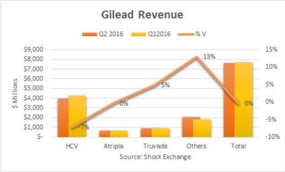
If you find this graph a little hard to follow, you’re not alone. You don’t usually see a graph with this many things wrong with it; here are a few of them:
- Time period order. All graphs (and almost all tables) show time periods going forward in time from left to right – the same direction we read text. This graph shows Q2 amounts to the left of Q1, making increases look like decreases, and vice versa.
- Total not clearly identified. The “Total” information is visually indistinguishable from the information about the four product lines comprising that Total. The presenter could have used white space, visual effects, different text effects, colors, or several other techniques to achieve a distinction, but didn’t. As a result, we completely miss the author’s point – namely, that increases in the revenues for the three smaller segments (Atripla, Truvada, and “Others”) were offset by a decline in HCV revenues.
- Growth rates make no visual sense. The Q/Q growth rates shown (i.e., -7%, 0%, 5%, 13%, and 0%) might be meaningful, but they’re utterly baffling presented where they are. This is a confusing and inappropriate use of a graph with two vertical axes – a common problem with that type of graph.
- Comparing growth rates doesn’t make mathematical sense. The percentages shown have no meaning taken together, because they’re all based on wildly different denominators.
- What does “%V” mean? It appears to be the Q/Q growth rate, but the only way I figured that out was by reading the article itself.
- The series line makes no sense. The brownish series line connecting the Q/Q growth rates is inappropriate. Series lines only make sense when the adjacent data points have a logical relationship to each other, for example because they show successive time periods.
For all of the above reasons, this graph wins my Black Pumpkin Award for the creepiest, scariest, most meaningless graph. The whole point of a graph is to give the reader a quick and reasonably accurate visual impression of the presenter’s key point(s). This one utterly fails on that score. HAPPY HALLOWEEN!
 “Painting with Numbers” is my effort to get people to focus on making numbers understandable. I welcome your feedback and your favorite examples. Follow me on twitter at @RandallBolten.
Other Topics