

Data Visualization, the U.S. House, and Voter Fickleness (#3)
Nov 26, 2014
The composition of the U.S. House of Representatives provides great material for data visualization. We’ve already produced a graph (click here for the original post, here for the improved version) that, like the Minard graphic of Napoleon’s march to Moscow popularized by Edward Tufte, presents seven types of data in a single two-dimensional space. It paints a rather complete picture. But does it really feed the bulldog?
No, it doesn’t. The original Washington Post graph examined, albeit poorly, how the president’s party does in mid-term elections. While our graph included that information, the answer to that question doesn’t really jump out at you. So let’s take a completely new pass at it:
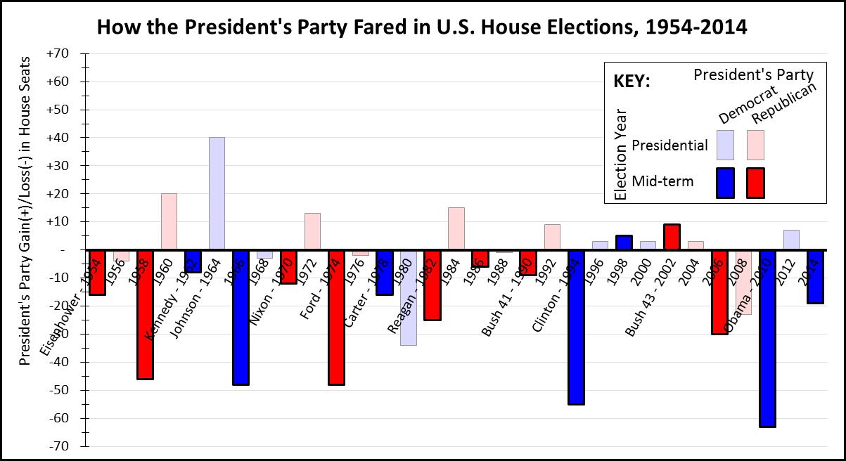
As before, we show each election from 1954 to 2014 on a timeline. However, this graph focuses on the change in the president’s party’s House membership. So, for example, a Democrat gain of seats (and therefore a Republican loss) is shown as a positive number if the president was a Democrat and a negative number if a Republican, and vice versa.
A bar is blue if the incumbent president is a Democrat and red if a Republican, as the graph’s key shows. However, the bars for mid-term election years are much darker than the bars for presidential election years, making it easy to distinguish mid-term from presidential election years.
The results are stunningly obvious: mid-term elections are nothing less than poison for the incumbent president’s party. Of the sixteen mid-term elections shown, the president’s party lost House seats in fourteen of them. Moreover, of the 31 election cycles shown, the five with the largest changes (’58, ’66, ’74, ’94, and ’10) all resulted in losses for the president’s party, and all occurred in mid-term years.
However, the graph provides relatively little insight into changes during presidential election years, and even less into the overall ebb-and-flow of partisanship in an obviously fickle American electorate. Moreover, the effort-ink ratio – to borrow from a Tufte term – is still very high, and these graphs take up a lot of space to make a small number of rather straightforward points.
So I still have to ask: Is this really the best way to present this information? I think not, so we’re not done yet. In my next post, we take a look at trying to draw a clearer picture, but using tables instead of graphs.
“Painting with Numbers” is my effort to get people to focus on making numbers understandable. I welcome your feedback and your favorite examples. Follow me on twitter at @RandallBolten.
No, it doesn’t. The original Washington Post graph examined, albeit poorly, how the president’s party does in mid-term elections. While our graph included that information, the answer to that question doesn’t really jump out at you. So let’s take a completely new pass at it:
As before, we show each election from 1954 to 2014 on a timeline. However, this graph focuses on the change in the president’s party’s House membership. So, for example, a Democrat gain of seats (and therefore a Republican loss) is shown as a positive number if the president was a Democrat and a negative number if a Republican, and vice versa.
A bar is blue if the incumbent president is a Democrat and red if a Republican, as the graph’s key shows. However, the bars for mid-term election years are much darker than the bars for presidential election years, making it easy to distinguish mid-term from presidential election years.
The results are stunningly obvious: mid-term elections are nothing less than poison for the incumbent president’s party. Of the sixteen mid-term elections shown, the president’s party lost House seats in fourteen of them. Moreover, of the 31 election cycles shown, the five with the largest changes (’58, ’66, ’74, ’94, and ’10) all resulted in losses for the president’s party, and all occurred in mid-term years.
However, the graph provides relatively little insight into changes during presidential election years, and even less into the overall ebb-and-flow of partisanship in an obviously fickle American electorate. Moreover, the effort-ink ratio – to borrow from a Tufte term – is still very high, and these graphs take up a lot of space to make a small number of rather straightforward points.
So I still have to ask: Is this really the best way to present this information? I think not, so we’re not done yet. In my next post, we take a look at trying to draw a clearer picture, but using tables instead of graphs.
“Painting with Numbers” is my effort to get people to focus on making numbers understandable. I welcome your feedback and your favorite examples. Follow me on twitter at @RandallBolten.
Related Blogs
Other Topics
Other Topics