

Healthcare Enrollments: Dissembling in Subtle Ways
Nov 15, 2013
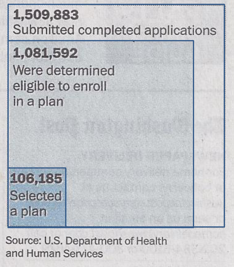
The Washington Post recently ran a front-page story headlined “106,000 have signed up for health coverage,” with a sub-heading of “Enrollment less than predicted.” Below is the graph shown at the top of the story, with my graph of the same data to its right:

Now, I ask you: Which of these graphs is correct?
The answer to that question is: They both are. Sort of. The difference between the two is that the right-hand graph scales the three graph elements along a single dimension – vertically – while the left-hand graph depicts the three elements as nested squares, where the areas are in correct proportion to each other – remember that area is calculated as height (or length) times width. (I actually took out a ruler and measured the squares, to verify that each of the three squares is about the right size.)
The problem with the left-hand graph is that people have difficulty visually processing the concept of area – this is one of the reasons why pie charts are such a terrible design choice. And since area is measured as height times width, the difference along a single dimension – let’s use height – doesn’t appear nearly as stark as it does in the bar chart at the right. On the bar chart, the number of people who have “selected a plan” looks downright puny.
Of course, let’s consider the source (shown at the bottom of the graph) – the U.S. Department of Health and Human Services. Can you imagine why HHS might not want some of these numbers to look so small?
With numbers, it’s possible to be dishonest while being correct, just as it is with words.
“Painting with Numbers” is my effort to get people talking about financial statements and other numbers in ways that we can all understand. I welcome your interest and your feedback.
Related Blogs
Other Topics
Other Topics