

Powerful Data Rendered Incoherent!
Aug 8, 2011
I just saw a 7/1/11 CNN interview with Scott Hodge, the President of the Tax Foundation, on the subject of “Who Pays Income Taxes in America.” I won’t elaborate on Hodge’s position here – you can see the video for yourself – but in the course of the interview CNN put the following slide up on the screen, using data provided by the Tax Foundation:
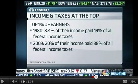
Do you have any idea what a statement like, “8.4% of their income paid 19% of all. . . taxes,” could possibly mean? Well, neither do I – it makes no sense. But I do happen to be familiar with the underlying data (which the Tax Foundation in turn got from the IRS). Here’s what the CNN slide should have said:
TOP 1% OF EARNERS
This is pretty significant information. First of all, only 1% of all earners paid 19% of the entire tax bill, which may seem like a lot, but by 2009 their share had climbed even further, to 38%. Second, this rise in the top 1%’s share of the tax bill was accompanied by an increase in that group’s share of total income from 8.4% to 20%. That is a significant increase in the unevenness of income distribution in the U.S. That’s not a taxation issue, but it is a trend that might be concerning to some.
My point here is the information the Tax Foundation provided has some powerful implications for the American electorate, but those implications were completely lost on CNN viewers because CNN garbled the message. And if the folks at CNN can’t understand the data they’re being given, how can they report on it accurately?
Quantation comes in many forms. Tables and charts and graphs are the forms we typically think of for presenting numbers, but sometimes numbers are presented in plain old English sentences. And in order to make the numbers comprehensible, you have to get the words right.
“Painting with Numbers” is my effort to get people talking about financial statements and other numbers in ways that we can all understand. I welcome your interest and your feedback.
Do you have any idea what a statement like, “8.4% of their income paid 19% of all. . . taxes,” could possibly mean? Well, neither do I – it makes no sense. But I do happen to be familiar with the underlying data (which the Tax Foundation in turn got from the IRS). Here’s what the CNN slide should have said:
TOP 1% OF EARNERS
- 1980: earned 8.4% of all income, and paid 19% of all federal income taxes
- 2009: earned 20% of all income, and paid 38% of all federal income taxes
This is pretty significant information. First of all, only 1% of all earners paid 19% of the entire tax bill, which may seem like a lot, but by 2009 their share had climbed even further, to 38%. Second, this rise in the top 1%’s share of the tax bill was accompanied by an increase in that group’s share of total income from 8.4% to 20%. That is a significant increase in the unevenness of income distribution in the U.S. That’s not a taxation issue, but it is a trend that might be concerning to some.
My point here is the information the Tax Foundation provided has some powerful implications for the American electorate, but those implications were completely lost on CNN viewers because CNN garbled the message. And if the folks at CNN can’t understand the data they’re being given, how can they report on it accurately?
Quantation comes in many forms. Tables and charts and graphs are the forms we typically think of for presenting numbers, but sometimes numbers are presented in plain old English sentences. And in order to make the numbers comprehensible, you have to get the words right.
“Painting with Numbers” is my effort to get people talking about financial statements and other numbers in ways that we can all understand. I welcome your interest and your feedback.
Related Blogs
Other Topics
Other Topics