

The Most Complete U.S. Politics Graph Ever
Nov 9, 2016
A couple of years ago, I wrote a series of blogs (click here for posts #1, #2, #3, #4, #5, and #6 in that series) about using data visualization to appreciate the fickleness of the U.S. electorate. A series of tables and graphs examined the ups & downs in the numbers of Republicans and Democrats in the House of Representatives since 1952, compared to the political party of the incumbent president. Well, I’ve updated the graph for the 2016 election, and extended the analysis back to 1920. Here’s the new graph, and the results are enlightening:
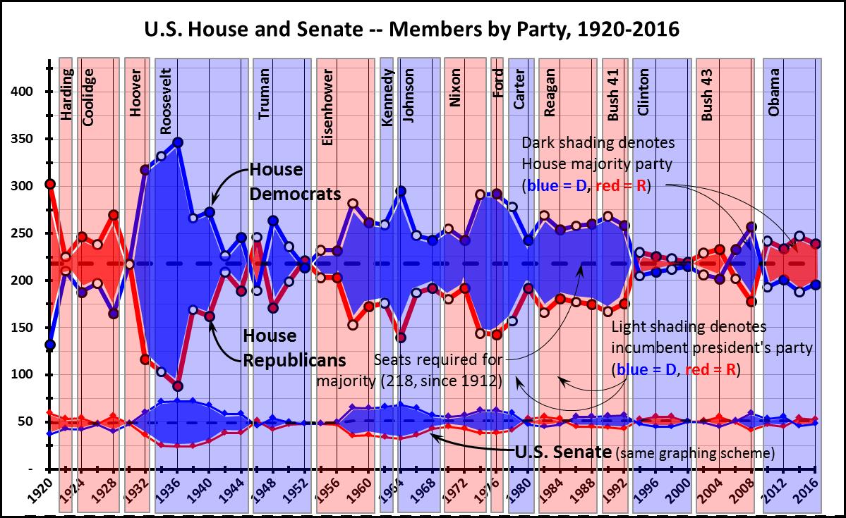
In a single graph, we can see for each of the 48 election cycles since 1920:
- Name of the incumbent president
- President’s political party (the light background shading, corresponding to the customary blue/red designation for Democrats/Republicans
- Number of Democrats in the U.S. House of Representatives (blue line/markers)
- Number of Republicans in the U.S. House of Representatives (red line/markers)
- House majority party (dark blue/red shading) and the size of the majority
- Seats needed for a majority in the House (broken line)
- Visual distinction between data points for presidential elections and mid-terms
Plus newly added bonus data for the U.S. Senate, including…
- Number of Republicans in the Senate
- Number of Democrats in the Senate
- Senate majority party and the size of the majority
- Seats needed for a majority in the Senate (broken line)
This is an amazing amount of data to be presented coherently in a single graph. Even so, it doesn’t clearly answer the question that I was originally curious about, which is how the president’s party has fared in mid-term elections. So here’s another graph:
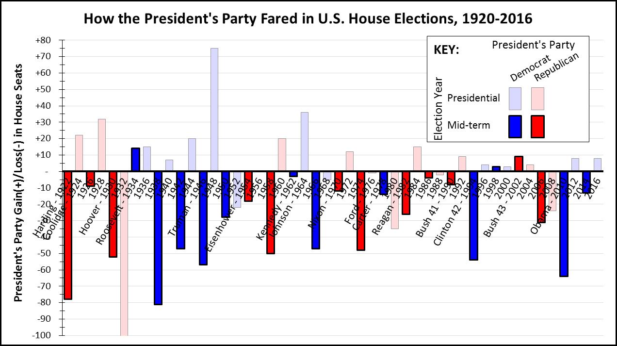
This graph presents less data, but the data point design – which distinguishes between mid-term (dark shading/borders on data points) and presidential (light shading/borders) elections – clearly shows that in 21 of the 24 mid-term elections since 1920, the president’s party has lost seats. Now we’re learning something!
The above graph does the job nicely, but so does a tiny little table:
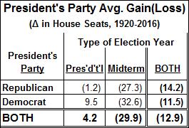
In a 2x2 table, we can see clearly that there is a huge difference between the president’s party’s results in mid-term elections versus presidential elections. And we also can see even if you look at both mid-term and presidential election years averaged together, the president’s party takes big losses, and that’s true for both Republican and Democratic presidents.
So now let’s look at another small table, but this time let’s introduce the concept of a “dynasty” – that is, a continuous period where a single party controls the presidency:
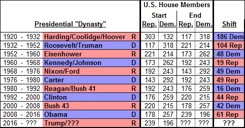
With the help of conditional formatting to use colored shading to denote the political party, we can see an unmistakable checkerboard pattern in U.S. elections over the last 96 years. My, but we are a fickle electorate!
And now we have a new “dynasty.” How long will it last? Will the checkerboard pattern be broken? What does the U.S. electorate have in store for Republicans and Democrats?
“Painting with Numbers” is my effort to get people to focus on making numbers understandable. I welcome your feedback and your favorite examples. Follow me on twitter at @RandallBolten.
Other Topics