

The Most Useful Graph Ever
Sep 22, 2015
Well-designed incentive compensation plans – especially sales commission plans – are an incredibly powerful way to motivate great performance. But designing a great plan is both an art and a science, and prone to design mistakes that are expensive and end up not motivating the desired performance. The commonest and most serious error plan designers make is to lay out the rules before deciding just what it is the enterprise is trying to accomplish. You can avoid that mistake with a simple, straightforward graph that I’ve drawn hundreds of times in my career. Follow these steps:
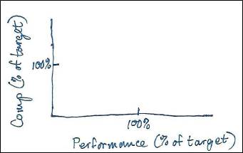
1. Draw your axes. “Performance” goes on the X-axis (i.e., the horizontal axis) and “Compensation” goes on the Y-axis (i.e., the vertical axis). For now, you don’t have to graph actual dollar amounts… just think in terms of percentage of target amounts:
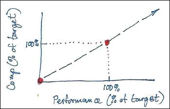
2. Plot the obvious points. Those would be 0% of target comp at 0% of target performance and 100% of comp at 100% performance. You might also find it useful to draw a reference line through those two points. (That reference line happens to be the graph for a plan with a commission rate that is constant across all levels of performance.)
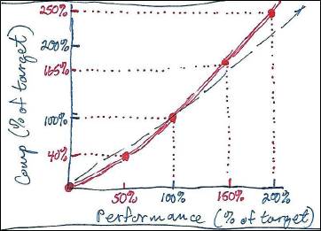
3. Plot some additional points and connect those points with straight lines or curves. Work with line managers and senior managers to get a sense of how much incentive comp they believe is appropriate at specific levels of performance. For example, here’s a graph for an “accelerated” sales commission plan – that is, one where above-quota performance is rewarded with increasing commission rates, and below-quota performance is penalized, where management has specifically suggested compensation of 40%, 165%, and 250% of target comp for performance at 50%, 150%, and 200% of target, respectively. Note that the compensation curve sits below the reference line for performance below 100% of target, and above the reference line for performance above 100% of target:
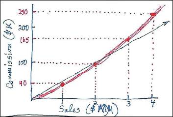
4. Plot the same graph, but this time with actual performance levels and comp amounts. Here’s what the graph might look like for the accelerated plan described above, where “Performance” is Sales, with a quota of $2,000,000, and target commission is $100,000:
You’re now ready to flesh out the comp plan with spreadsheets and other formal documentation.
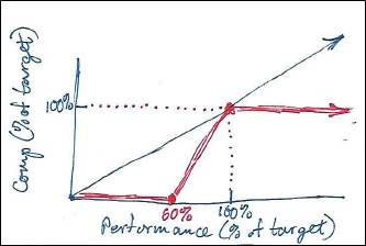
Just for comparison, here’s another example, this time for a typical management MBO plan where no bonus is earned until a specific performance level, such as 60%, is met, and the maximum bonus is the target MBO amount:
In this way, you can visualize any approach to incentive comp, form conclusions about whether that’s the approach you want, and then fill in the blanks to design a comp plan that actually does what you intended.
Sometimes a picture IS worth 1,000 words.
“Painting with Numbers” is my effort to get people to focus on making numbers understandable. I welcome your feedback and your favorite examples. Follow me on twitter at @RandallBolten.Other Topics