

Using Numbers to Understand the Future
Nov 19, 2013
When done properly, numbers provide a profound glimpse into the future. Here are two graphs from a Washington Post story about the possible implications of China’s recent changes to their “one-child” policy (for easier-to-read versions, click here for the Post’s original story):
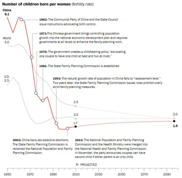

Both graphs look at the past – from 1950 through 2010 – as well as the future – out through 2100, showing birth rates and total population. Historical information about population is of course closely tracked in most countries and generally pretty accurate. And the trends driving population – such as birth rates, life expectancy, and migration – are sufficiently well-understand and massive enough that they rarely change quickly, making projections even far into the future pretty reliable.
This is a great example of numbers, properly presented, suggesting important issues. For example, note that starting around 2030, China’s population is forecast to decline, even in the face of what are almost certainly assumptions if increasing life expectancy. On the face of it that’s good news if you’re worried about the population explosion, but on the other hand. . . can a huge nation like China continue to be an economic juggernaut when it’s population is declining and aging? What does that mean for the rest of the world? And is that good news or bad news?
Like a picture, a few numbers – in a table or in a graph – can be worth 1,000 words. When we can use numbers to better understand the future we should grab at the opportunity – we’ll look at a few of those opportunities in future posts.
“Painting with Numbers” is my effort to get people talking about financial statements and other numbers in ways that we can all understand. I welcome your interest and your feedback.
Related Blogs
Other Topics
Other Topics