

R.I.P. Hans Rosling, Explainer Extraordinaire
Feb 22, 2017
Hans Rosling, age 68, died earlier this month. He contributed more than almost anyone to helping people truly understand the world as it is. In an era when we have gone overboard for the glitziest data visualization techniques – frequently at the expense of comprehensibility or of any meaning whatsoever – Rosling’s presentations are informative while being imaginative and entertaining. His work demonstrates the potential that data visualization can have, but all too often doesn’t – we’ll see one of his best examples here.
Rosling was the leading light behind Gapminder, a website devoted to providing the world with information about the state of the world, and combatting widespread ignorance about that information. The data you’ll find on the site is easy and fun to use, as well as to understand – not to mention surprisingly optimistic about worldwide trends.
For example, Gapminder’s “Wealth and Health of Nations” uses a “bubble chart” to look at the relationship between per capita income and life expectancy across all the countries of the world:
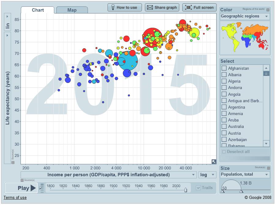
The worldwide correlation between these two metrics is visually obvious. For certain types of analysis, bubble charts can be an effective way to present three dimensions of data on a two-dimensional surface. Here, life expectancy and GDP/capita are mapped along the vertical and horizontal axes, while the size of each country’s bubble is proportional to its population. That way, the most populous countries have the strongest visual impact – the two largest bubbles are China (red) and India (light blue). But wait, there’s more! This infographic’s many excellent features include:
- You can see the graph for any year since 1800 by dragging the scroll box left or right along the bottom. Clicking “Play” will run a “movie” showing the graph’s evolution over the entire 200+ years – I give that movie a 5-star rating! (And you’ll see what I mean about the optimistic perspective.)
- Floating the cursor over an individual country’s bubble causes that country’s four data values (name, population, life expectancy, and GDP/capita) to pop up.
- The country bubbles are color-coded by geographic region. When you float the cursor over a region in the map in the upper right, that region’s country bubbles flash on and off.
- You can present a subset of specific countries by Selecting only those countries in the list box at the right.
There are lots of amazing special effects in Gapminder’s infographics – effects that even skilled Excel users would have a hard time replicating. But all of these special effects have one thing in common: They serve a purpose. They are there to help you get more out of the data, not to just be pretty and impress you with the presenter’s skill.
Sprinkled throughout my book, Painting with Numbers, there are eighteen Deadly Sins of Presenting Numbers. Here is Deadly Sin #3:
3. Using visual effects for any reason other than clarifying, distinguishing, or adding meaning to information
And that’s one reason I will miss Hans Rosling. (By the way, the above Deadly Sin is as applicable to tables as it is to graphs. Stay tuned.)
“Painting with Numbers” is my effort to get people to focus on making numbers understandable. I welcome your feedback and your favorite examples. Follow me on twitter at @RandallBolten.Other Topics