

More Chartjunk about Obamacare
Dec 7, 2013
“Chartjunk” is a term coined by Edward Tufte to describe elements in graphs or approaches to graphing that detract from the meaning of the graph or even skew the depiction of the graph to the point where it will get misinterpreted. For the interested observer, the media efforts to present information on Obamacare and its rollout have created a veritable goldmine of chartjunk. (See my recent post on HHS dishonesty.)
A 12/1/13 Washington Post article, about the challenges people faced buying individual health insurance, had the following graph:
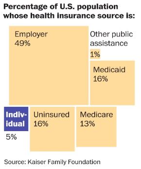
The problem with this graph is that it’s virtually impossible to get any meaning from it visually. There’s no apparent order to how the elements are arrayed on the page, they’re extremely hard to compare to each other, and even though the “Individual” box is set off by a different color, it’s hard to tell what the focal point or the intended message of the graph is. The only useful information is the numbers provided below the captions, and that being the case, why bother taking up a lot of space with a graph?
Here are two much better ways to present the same information visually:
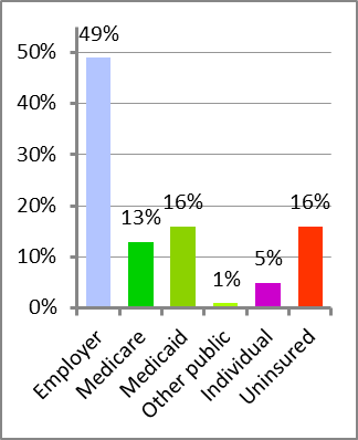
Some of the key good characteristics of the bar graph on the left:
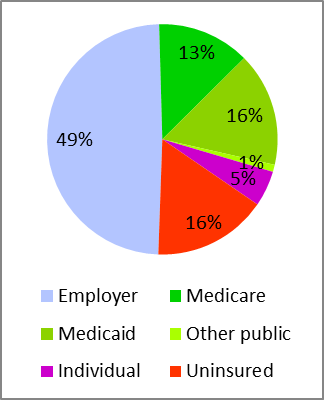
As much as I usually detest pie charts, in this case it’s not a bad choice, with the same element order and coloring as described above. Especially with the government-funded alternatives grouped together in different shades of the same color, the reader does get a sense of how Americans fall into the main categories of insurance sources. (For another not-so-bad example of using a pie chart, click here.)
Information presenters are often prone to believe that graphs are better than tables, so data can be accessible to the numerically impaired. That simply isn’t true. And further, they often believe that all graphical presentations are equally effective. As we see here, that isn’t true, either.
“Painting with Numbers” is my effort to get people talking about financial statements and other numbers in ways that we can all understand. I welcome your interest and your feedback.
A 12/1/13 Washington Post article, about the challenges people faced buying individual health insurance, had the following graph:
The problem with this graph is that it’s virtually impossible to get any meaning from it visually. There’s no apparent order to how the elements are arrayed on the page, they’re extremely hard to compare to each other, and even though the “Individual” box is set off by a different color, it’s hard to tell what the focal point or the intended message of the graph is. The only useful information is the numbers provided below the captions, and that being the case, why bother taking up a lot of space with a graph?
Here are two much better ways to present the same information visually:
Some of the key good characteristics of the bar graph on the left:
- The bar graph format, with equidistant elements all along the same axis, makes it visually easy for the reader to draw comparisons and get a sense of magnitudes, even if the numbers weren’t presented as well.
- The categories have a logical order, starting with the largest (Employer) at the left, the three government-funded ones (Medicare, Medicaid, and Other Public) grouped together, and Uninsured by itself at the right.
- The colors are meaningful and distinguishable. The three government-funded categories are varying shades of the same color (green), the strongest color is the category that is the subject of the article (Individual), and the most problematic number (Uninsured) is in evocative red.
As much as I usually detest pie charts, in this case it’s not a bad choice, with the same element order and coloring as described above. Especially with the government-funded alternatives grouped together in different shades of the same color, the reader does get a sense of how Americans fall into the main categories of insurance sources. (For another not-so-bad example of using a pie chart, click here.)
Information presenters are often prone to believe that graphs are better than tables, so data can be accessible to the numerically impaired. That simply isn’t true. And further, they often believe that all graphical presentations are equally effective. As we see here, that isn’t true, either.
“Painting with Numbers” is my effort to get people talking about financial statements and other numbers in ways that we can all understand. I welcome your interest and your feedback.
Related Blogs
Other Topics
Other Topics