And the Oscar for Clarity Goes to. . . the FDA!
Mar 4, 2014
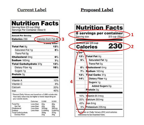
We’ve recently run posts about bad quantation in the media, about Olympic medal counts and Oscar betting odds. This time we discuss good quantation – the Food & Drug Administration’s proposed changes to the “Nutrition Facts” label. This is a great example of how small changes in the way we present numbers can have a significant impact. Though small, the changes are sensible and meaningful, and therefore likely to be highly controversial in some quarters.

The red circles identify the changes I consider most significant with respect to quantation, roughly in priority order:
What’s interesting about all this is how small, seemingly unimportant changes to the way numbers are presented – font size, position on the page, adding ratios to the raw numbers – can make such a big difference in what the information means to the audience. Consider that, the next time you ponder how effective and meaningful your company’s financial statements are.
(For the FDA’s own press release on this subject, click here.)
“Painting with Numbers” is my effort to get people talking about financial statements and other numbers in ways that we can all understand. I welcome your interest and your feedback.

The red circles identify the changes I consider most significant with respect to quantation, roughly in priority order:
- Servings per container is shown in larger, boldface type, to make it absolutely clear what is meant by a “serving.” (Although not shown here, the FDA is also proposing to get much more realistic about what a single serving really is. No longer will a muffin be considered two servings just because it’s huge, nor a 20-ounce soda be considered two-and-a-half servings – after all, who has that kind of willpower?
- Calorie count gets similar emphasis, in recognition that obesity is the largest diet problem we have, and that caloric intake is the most significant contributor to that problem.
- Calories from fat is no longer presented. Calories is calories is calories – regardless of the source. And anyway, current nutrition theory says there are “good” fats.
- % of DV (Daily Value) now has a more prominent position, to the left of the item in question. To almost all of us, how much of the Daily Value we’re consuming is much more relevant and meaningful than the total number of grams or milligrams – quantities that only a scientist can appreciate.
What’s interesting about all this is how small, seemingly unimportant changes to the way numbers are presented – font size, position on the page, adding ratios to the raw numbers – can make such a big difference in what the information means to the audience. Consider that, the next time you ponder how effective and meaningful your company’s financial statements are.
(For the FDA’s own press release on this subject, click here.)
“Painting with Numbers” is my effort to get people talking about financial statements and other numbers in ways that we can all understand. I welcome your interest and your feedback.
Related Blogs
Other Topics
Other Topics


