

Presenting Graphs That We Actually Care About
Feb 24, 2014
It’s important to present numbers that your audience actually cares about. We sometimes lose sight of that in an effort to turn out a beautiful table or graph. I have Ira Apfel of the Association for Financial Professionals and the editor of AFP’s Exchange, to thank for a great example of this point. Here’s a snip from the “Medal Tracker” page of the ESPN website (click here to visit the site):
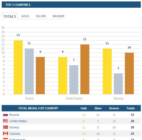
Now first of all, it looks great and it’s nicely laid out. I especially like the color motif of the graph, and the table is really informative. But does the graph really tell you what you’re interested in? Do we really care about the bronze medal count of the top three countries? And wouldn’t you like to see a graph that shows more than just the top three countries, without using more space?
With that in mind, here’s another way of presenting the ESPN graph:
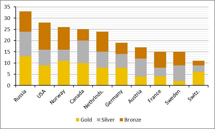
In roughly the same amount of space, this graph presents the top ten countries, and the stacked column format with the gold medals at the bottom enables us to see the gold medals count as well as total medals. Also, the gold/silver/bronze stacking gives us a glimpse at which countries did well on gold AND silver medals, and who filled up on bronze medals. (O, Canada!)
These are small differences in graphing choices, but a little thought about what the audience might be most interested in can make a big difference in audience comprehension, especially when they’re only going to spend about 30 seconds examining your report.
“Painting with Numbers” is my effort to get people talking about financial statements and other numbers in ways that we can all understand. I welcome your interest and your feedback.
Now first of all, it looks great and it’s nicely laid out. I especially like the color motif of the graph, and the table is really informative. But does the graph really tell you what you’re interested in? Do we really care about the bronze medal count of the top three countries? And wouldn’t you like to see a graph that shows more than just the top three countries, without using more space?
With that in mind, here’s another way of presenting the ESPN graph:
In roughly the same amount of space, this graph presents the top ten countries, and the stacked column format with the gold medals at the bottom enables us to see the gold medals count as well as total medals. Also, the gold/silver/bronze stacking gives us a glimpse at which countries did well on gold AND silver medals, and who filled up on bronze medals. (O, Canada!)
These are small differences in graphing choices, but a little thought about what the audience might be most interested in can make a big difference in audience comprehension, especially when they’re only going to spend about 30 seconds examining your report.
“Painting with Numbers” is my effort to get people talking about financial statements and other numbers in ways that we can all understand. I welcome your interest and your feedback.
Related Blogs
Other Topics
Other Topics