

Setting the Bar (Graph) Lower... Much Lower
Apr 1, 2015
Happy April Fool’s Day! In celebration, let’s take a look at some of the most messed-up, incomprehensible recent examples of quantation. Not surprisingly, all are graphs. But some come from sources that definitely should know better. With some, try to figure out what went wrong; with others, if you can figure out what the heck they’re trying to say, please let me know. Enjoy!
How much do you spend? We’ll start with a simple one, from the imgur.com website (beats me where they got it, but click here to see the original):
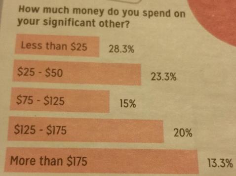
Do those percentages look like they match the length of the bars? And how about that strange scaling? And is that per day? Per year? What went wrong here?
I really hate to pick on a national institution like the Girl Scouts, but take a look at this graph that appeared in an article on CNN.com , about how the Girl Scouts are going online to sell cookies. We’re talking digital cookie sales here, not digital cookies:
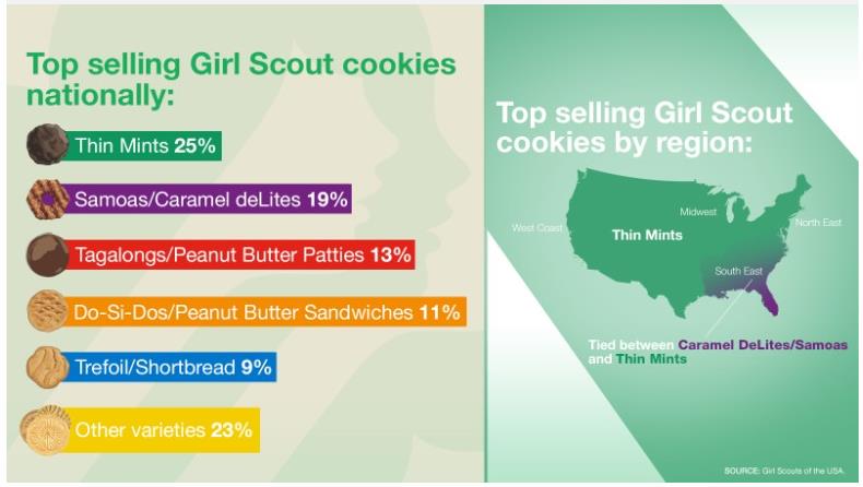
Again, do the percentages match up to the size of the bars? What went wrong here? And how will this affect Girl Scout cookie sales?
The Hebrews do it backwards, which is absolutely frightening! (Google that whole line, if you’re under 50.) An Israeli friend, No’am Newman, sent me this, from a newpaper article about how people use the Internet:

In case you’re wondering, here’s the translation:
- Met partners on the internet – 32%
- Members of family groups in WhatsApp – 70%
- Visit a doctor after reading about their medical problem on internet – 56%
- Watch TV series and films via the internet – 63%
- Listen to music on the net – 80%
Again, do the bar sizes match the percentages? What happened here?
Yes, there’s always good ol’ Fox News! No discussion of incompetently presented information would be complete without at least one pie chart. We have Fox News – OK, OK, the local Fox affiliate in Chicago – to thank for this one:
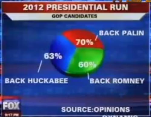
It doesn’t get much more incoherent and meaningless than this. If you want to see the reporter – uh, I mean the teleprompter reader – blithely whip through this one, click here. Again I ask: What went wrong here?
HUH??? Please, please tell me what the heck this graph trying to say, about the critically important subject of what blue-chip basketball players major in in college:
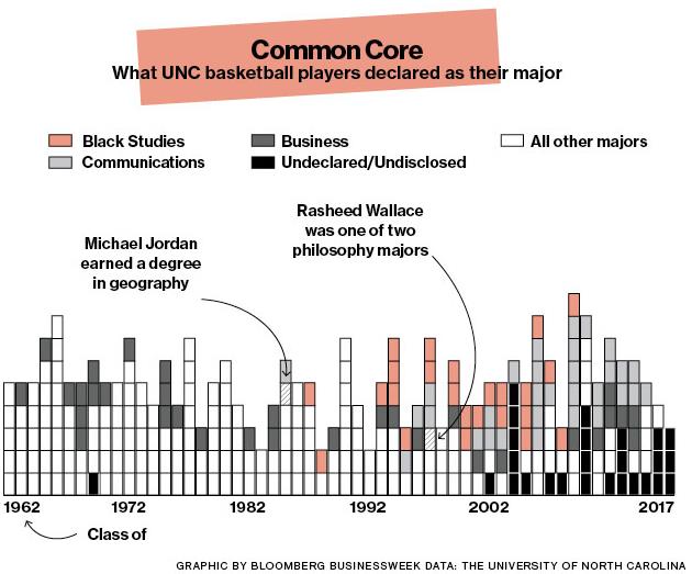
… and this is from Bloomberg BusinessWeek, for goodness sake. Warning: there will be a two-hour exam on this in tomorrow’s class, with both multiple choice and essay questions.
A breath of fresh air from a sitcom! At last – a coherent juxtaposition between bar graphs and pie charts, and surprisingly, we have Jason Segel of “How I Met Your Mother” to thank for it:
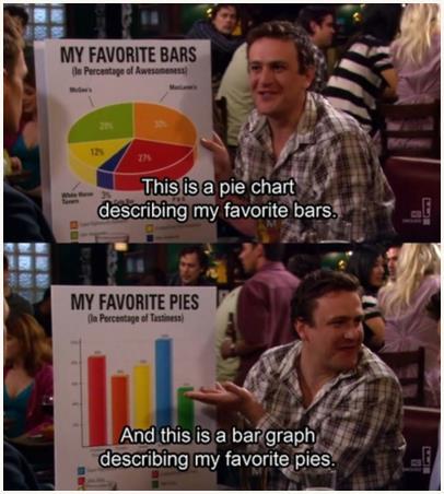
I might quibble about the repetitive use of colors, and I am not personally a fan of 3-D graph elements, but all in all I give kudos to the deep thought behind this elegant presentation. (Click here for the YouTube clip of this scene.)
Along these lines, I once again call your attention to the world’s most accurate pie chart. Click here to view it. In at least one sense, it might not be so accurate. Can you spot the problem?
“Painting with Numbers” is my effort to get people to focus on making numbers understandable. I welcome your feedback and your favorite examples. Follow me on twitter at @RandallBolten.
Other Topics