

The Second-Most Useful Graph Ever
Dec 7, 2015
In a recent post, “The Most Useful Graph Ever,” we looked at using a graph to design an incentive compensation plan. This was a great example of quantation not only because it illustrated what data visualization is really for, but designing incentive plans is a critical business process that’s all too often handled poorly. In this post, let’s look at the U.S. stock market over a very long period of time. Understanding the basics of investing is critical for almost everyone’s financial security, and a clear presentation of some basic information could help a lot of people who find the whole thing intimidating.
For stock market performance, we use the S&P 500 Index, generally considered the market’s broadest measure. (Data from the S&P Dow Jones Indices website.) For a time horizon, I chose to go back to January 1920 – that’s 95 years and, just for the sake of an honest review, includes the 1920s run-up to the Crash of 1929. The numbers are monthly averages, which give a sense of intra-year volatility that the annual average doesn’t. Here’s the graph of that data (with a red exponential trend line calculated by Excel):
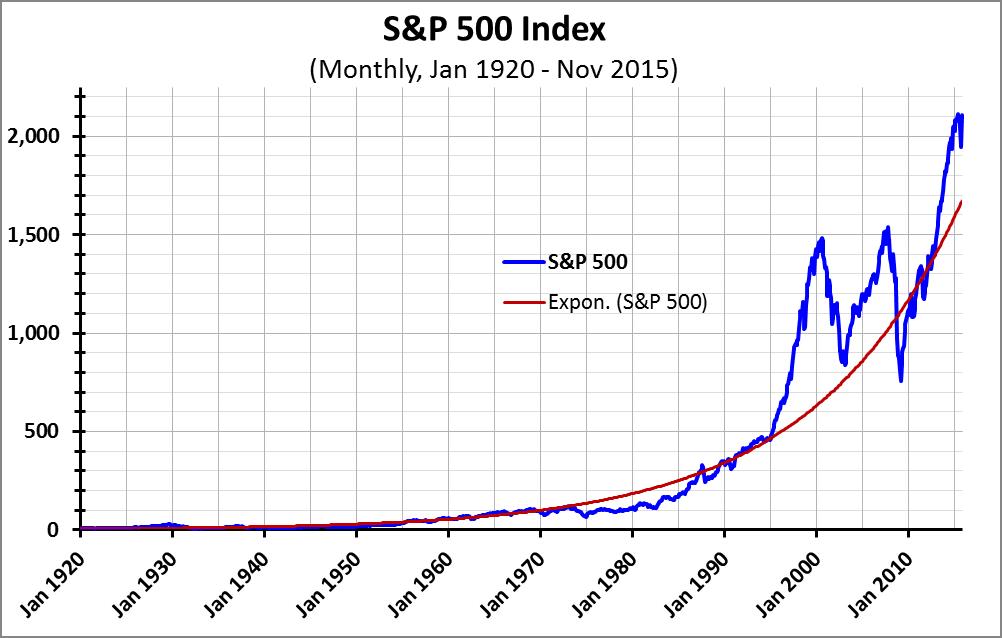
This graph shows the dramatic growth in U.S. stock, but it’s hard to use as a visual tool – the “miracle of compound interest” means the numbers until about 35 years ago look minuscule. Visually, it looks like the market bumbled along until about 1980, and then just exploded. That’s not the case. The same effect makes the last 20 years or so look even more chaotic and volatile than they actually were. So let’s try this graph again, this time with a logarithmic rather than a linear vertical axis:

Logarithmic scales make it possible to compare period-to-period growth rates. As a result, that red exponential trend line – showing average annual growth of 6.3%/year over the 95 years – is now a straight line rather than the curved line shown on the previous graph. The revised graph now shows clearly that the S&P 500 has been on a steady upward trend for a very long time.
There’s one thing still missing – when you look at investment returns you need to compare those returns against inflation. Here’s the same graph, but this time for real (i.e., adjusted for inflation) values for the S&P 500 Index:
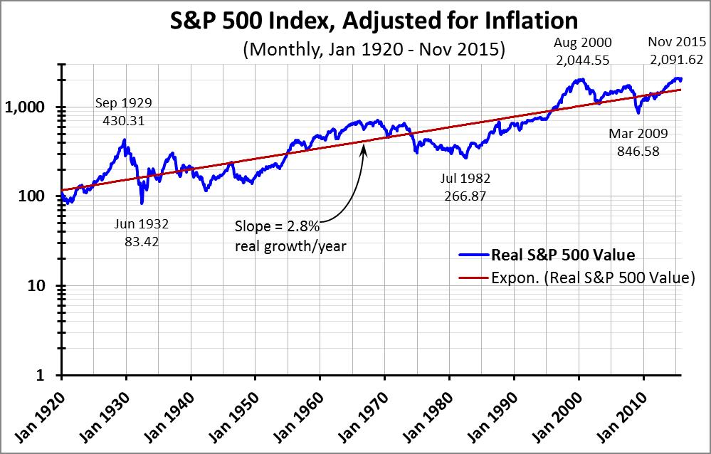
This one looks a tiny bit bumpier, and of course flatter, but the trend is still unmistakable: Over a very long period of time, a broad stock market investment beats inflation by about 2.8%/year. What people often focus on is the significant shorter-term changes – like the drop from Sep 1929 to Jun 1932, or from the peak of the ‘90s bubble in Aug 2000 to the bottom from the Great Recession in Mar 2009. But for those who can stomach the short-term fluctuations, the long-term trends are powerful and upward.
Oh wait, there’s one more consideration: the S&P 500 Index is a price index, which doesn’t factor in dividend yields. Over the 95 years of this analysis, the S&P 500 stocks have had an average dividend yield of almost 4%, meaning an annual inflation-adjusted return of nearly 7% for those reinvesting their dividends!
The financial power of investing a steady amount of money in the U.S. stock market over a long period of time is impossible to overlook. The graphs we’ve looked at here tell a big part of the story, but to really get that point across, good quantation suggests that a table will work better than a graph. We’ll see that in next week’s post.
“Painting with Numbers” is my effort to get people to focus on making numbers understandable. I welcome your feedback and your favorite examples. Follow me on twitter at @RandallBolten.Other Topics