Yes! Some Decent Graphs about the Economy! Well, Mostly.
Jan 9, 2017
For New Year’s reading I commend “What Kind of ‘Jobs President’ Has Obama Been – In 8 Charts,” from the NPR website. The eight graphs referred to are straightforward and easy to understand. They show critical data in a journalistically ethical way – a characteristic in very short supply these days. Regardless of which side of the political fence you’re on, the graphs contain data that will support your perspective. Lastly, with a couple of exceptions I’ll discuss below, all the graphs are surprisingly good examples of quantation.
If you’re an Obama lover, there’s clear evidence of a long, steady recovery, with unemployment now close to pre-recession levels and wage growth on the rise. If you’re less fond of the man, you’ll observe that given the condition of the economy at the beginning of 2009, every major metric had nowhere to go but improve. Moreover, even if you accept the premise that U.S. presidents have a significant impact on nationwide economic trends, some would see the improvements as agonizingly slow compared to other recoveries in the past. Lastly, some of the apparently improved metrics – such as the unemployment rate and the labor participation rate – may be glossing over subtler but still disturbing economic and demographic trends.
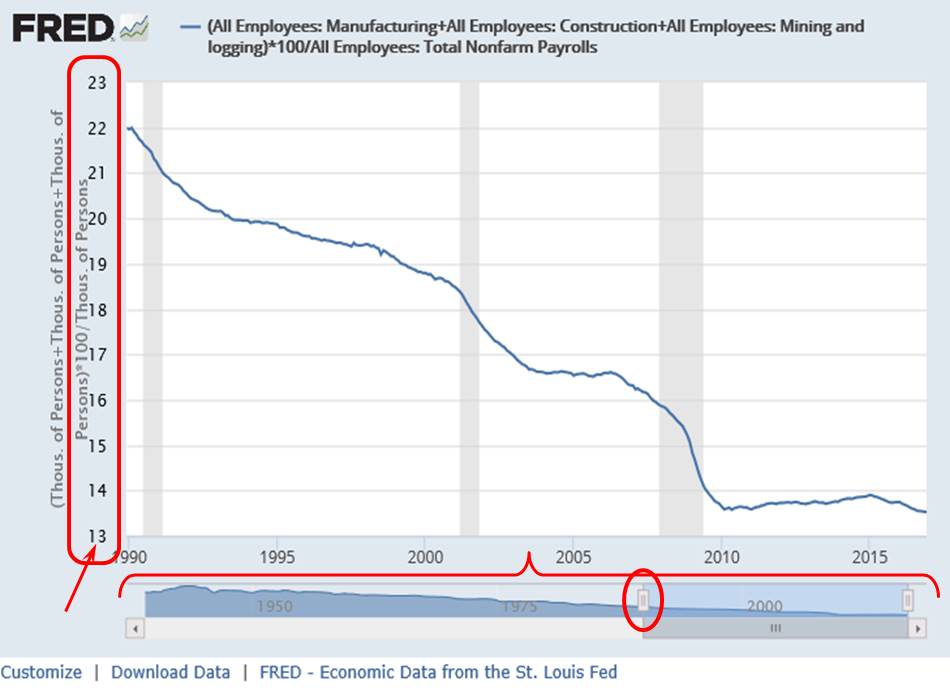
My main quibble is a graph produced by the sober and respectable Federal Reserve Bank of St. Louis, from its absolutely outstanding “FRED” database of economic data:

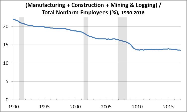
This graph, of the percentage of the labor force that “makes things” (FRED includes manufacturing, construction, mining, and logging), shows a steady decline in “makers” since 1990. But look again at the vertical axis (see my circle in red at the left). It violates the principle that scales with a “natural zero” should start at zero. The problem is that the graph appears to show that the percentage of “makers” has plummeted from about 22% of the labor force in 1990 to nearly zero in the last few years. Here’s what the same graph looks like with the vertical axis on the left starting at zero:

You now get a truer sense of the real decline in the share of “makers” in the labor force. You can still clearly see a significantly declining trend, with no nagging sense that the scale is being manipulated to make the change look more dramatic than it really is.
This graph illustrates a critically important trend – one that figured prominently in the presidential race – and it deserves an accurate presentation. See my next post for further discussion on this trend, but in the meanwhile, hats off to NPR for a cogent and honest presentation of the issues.
I’m confident the FRED graph was not intended to mislead. In fact, when you create a graph in Excel using the wizard, Excel automatically scales the vertical axis the way it’s shown in the first graph above – to get the scale right, you must use the “Format Axis…” menu option and change the Minimum axis value to be Fixed at 0. In other words: NEVER TRUST THE EXCEL WIZARD!
I also want to point out an extremely cool feature that the St. Louis Fed incorporates into some of its FRED graphs. Note the horizontal scroll bar at the bottom (set off by my red bracket), with the scroll box set at a starting value of 1990 (circled in red). By dragging the scroll box left or right (you can try this out in the NPR article I link to), you change the starting year of the graph from 1990 to any year going all the way back to 1939. It’s very informative, and we’ll discuss that in more detail in my next post.
“Painting with Numbers” is my effort to get people to focus on making numbers understandable. I welcome your feedback and your favorite examples. Follow me on twitter at @RandallBolten.Other Topics


